Meaningful motifs Graphic designer Shaun Vincent’s projects tell a story of spirit and significance
Read this article for free:
or
Already have an account? Log in here »
To continue reading, please subscribe:
Digital Subscription
One year of digital access for only $75*
- Enjoy unlimited reading on winnipegfreepress.com
- Read the E-Edition, our digital replica newspaper
- Access News Break, our award-winning app
- Play interactive puzzles
*Billed as $5.77 plus GST every four weeks. After 52 weeks, price increases to the regular rate of $19.95 plus GST every four weeks. Offer available to new and qualified returning subscribers only. Cancel any time.
Monthly Digital Subscription
$4.99/week*
- Enjoy unlimited reading on winnipegfreepress.com
- Read the E-Edition, our digital replica newspaper
- Access News Break, our award-winning app
- Play interactive puzzles
*Billed as $19.95 plus GST every four weeks. Cancel any time.
To continue reading, please subscribe:
Add Free Press access to your Brandon Sun subscription for only an additional
$1 for the first 4 weeks*
- Enjoy unlimited reading on winnipegfreepress.com
- Read the E-Edition, our digital replica newspaper
- Access News Break, our award-winning app
- Play interactive puzzles
*Your next Brandon Sun subscription payment will increase by $1.00 and you will be charged $17.95 plus GST for four weeks. After four weeks, your payment will increase to $24.95 plus GST every four weeks.
Read unlimited articles for free today:
or
Already have an account? Log in here »
Hey there, time traveller!
This article was published 20/05/2022 (1520 days ago), so information in it may no longer be current.
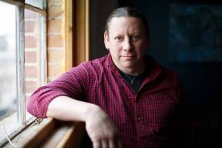
The first thing to know about Shaun Vincent is that he’s a hands-on kind of guy.
When we meet on a morning in May, he’s not behind a desk or drawing table — places where you might expect to find a graphic designer, and the founder and creative director of an eponymous creative marketing firm.
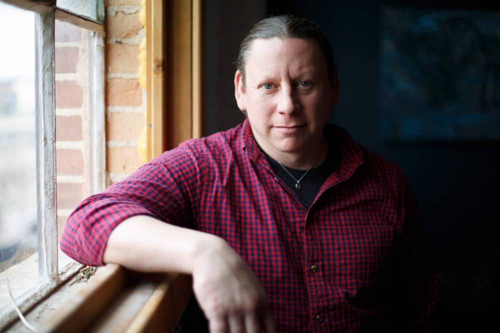
No, he’s fixing a window in the boardroom at Vincent Design Inc., which is located on the third floor of the Social Enterprise Centre, a collaborative workspace in a renovated warehouse in Winnipeg’s North End. It’s one of the first nice days of spring, and he wants to let in some fresh air. The blue sky is framed out behind him and, when the window finally relents, it’s like an exhale. The warm breeze rushes in, carrying the rumble and screech of passing trains.
Over the past 15 years, the 45-year-old Michif designer and his team have emerged as leaders in modern Indigenous design, creating visual identities for a host of clients, including Canadian Geographic, the National Centre for Truth and Reconciliation, Keewatinohk Inniniw Minoayawin Inc., Ndinawe and dozens of others.
Vincent Design was also behind the high-impact Protect Our People MB campaign, aimed at motivating Indigenous communities to get their COVID-19 vaccines.
In April, Vincent Design finally unveiled one of its most important projects yet: the design work associated with the historic transfer of the flagship Hudson’s Bay building in downtown Winnipeg to the Southern Chiefs’ Organization (SCO). The project, called Wehwehneh Bahgahkinahgohn, which is Anishinaabemowin for “it is visible,” will see the building transformed into a multi-use community hub. It was an act of reconciliation that earned international attention.
The second thing to know about Shaun Vincent is that he’s thoughtful. He never includes anything superfluous in his designs. Everything must mean something.
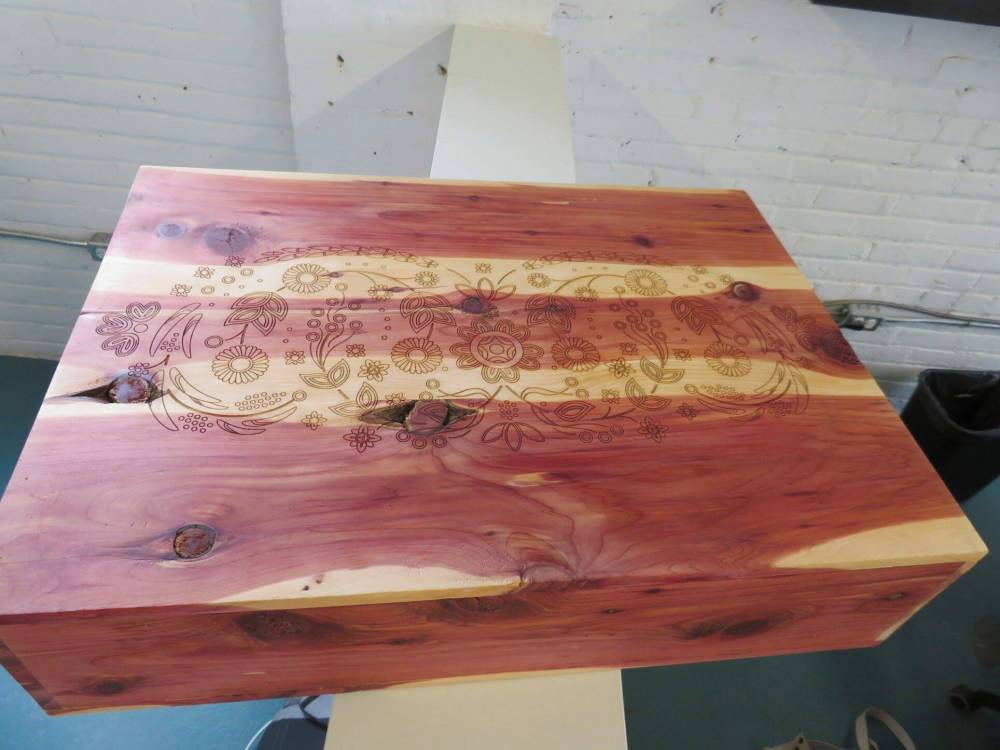
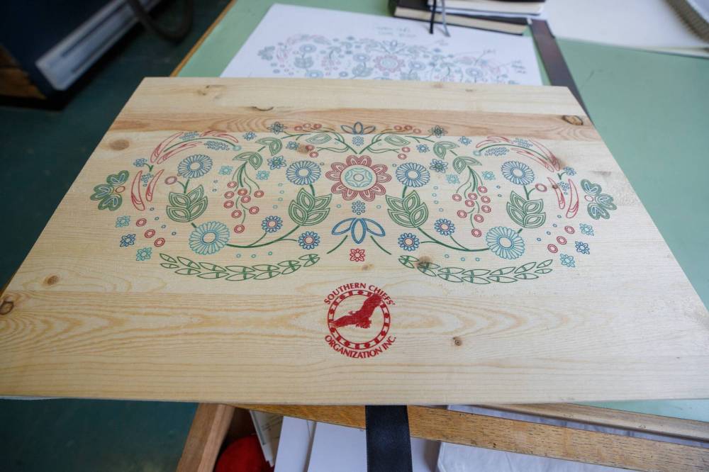
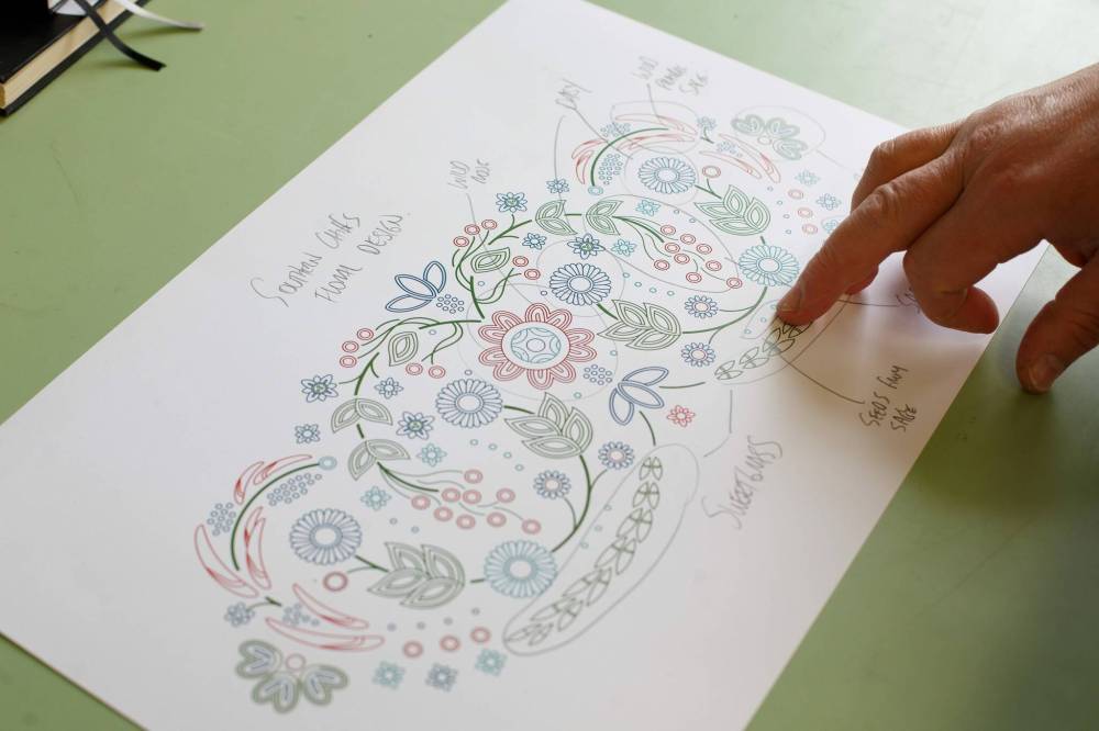
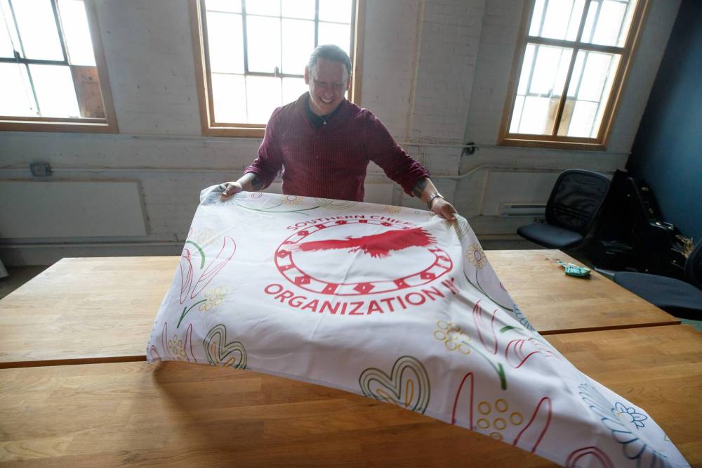
The dynamic floral motif Vincent designed for SCO is a case in point. There are 34 floral elements to represent the 34 First Nations represented by SCO, inspired by plants and medicines meaningful to the Dakota and Anishinaabe people. Saskatoon berries. Prairie sage. Wild Rose. Braided sweetgrass.
Even the tiniest elements are imbued with meaning. “The seeds represent carrying forward, planting for the future,” he explains.
The floral motif winds its way through everything related to the project’s launch: the initial proposal, the building renderings, the banners, invitations, programs and window displays — even the cookies served at the event.
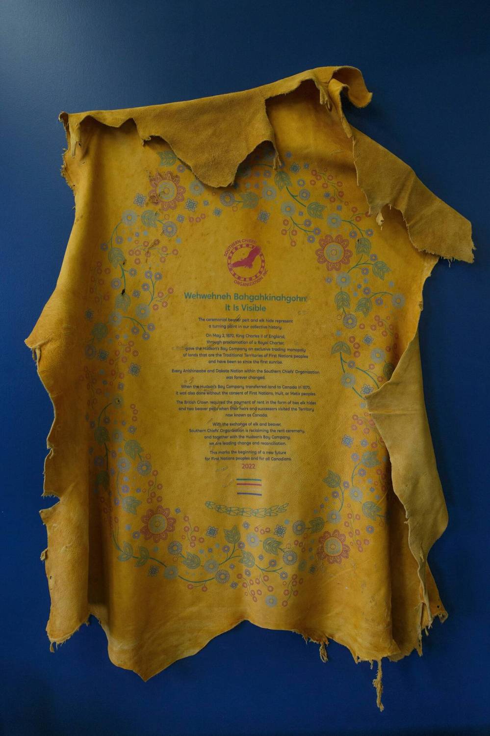
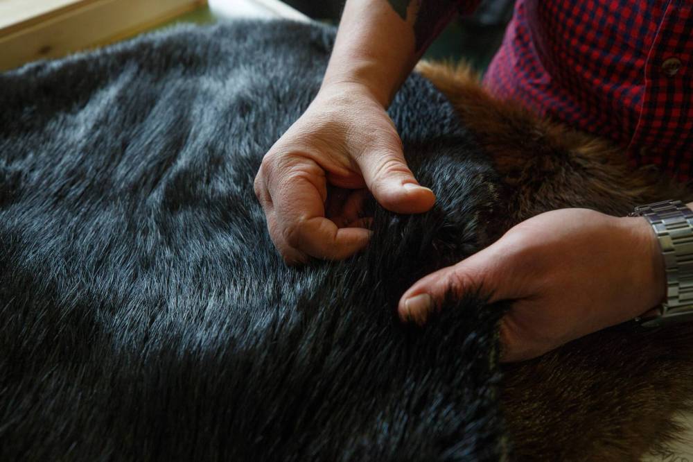
But perhaps the most meaningful iteration was the motif’s inclusion on the hides and blankets presented at the traditional rent ceremony. As outlined in HBC’s Royal Charter, the rent of two beaver and two elk was paid by HBC whenever a British monarch visited Canada.
Jennifer Moore Rattray, the chief operating officer at SCO, said the organization wanted to reclaim the rent ceremony, which has only been performed four times in HBC’s history, and approached Vincent to ask how that might be reflected in design.
Instead of having Grand Chief Jerry Daniels present unadorned pelts to Richard Baker, the governor and executive chairman of HBC, as symbolic payment for the building, Vincent Design had the floral motif and text printed onto them. Renée Campbell, a designer on the Vincent Design team, carefully stitched the printed elk hides to the glossy black beaver pelts — nerve-racking work, as it had to be done in one go.
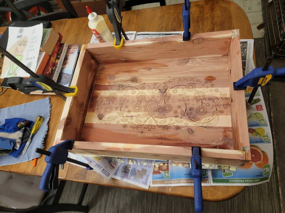
Printed elk pelts were also used to present the initial proposal — a tome also designed by Vincent’s team — and housed in boxes Vincent made. (There’s that hands-on thing again.)
“That was just so perfect, to be able to have a ceremonial element that was so thoughtfully produced, and that reflected SCO and who we are and our 34 nations in all their beauty,” Rattray says. “It really added so much. I mean, it could have just been black beaver pelts. It could have just been elk hides. But it was so much more than that. They were actual pieces of art.
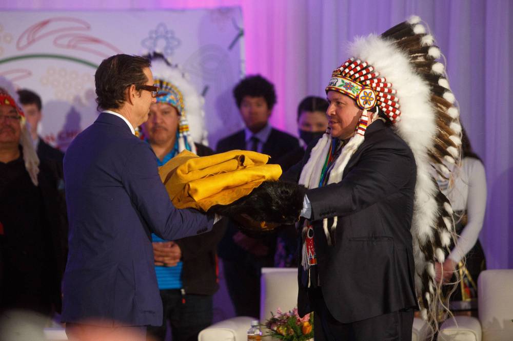
“And what an incredible gift for Governor Baker and for HBC that really respects the gift of reconciliation that they’ve given to us, which is that incredible and iconic HBC building.”
Vincent was thrilled to be part of this project, two years in the making with an adrenaline-fuelled race to the finish line. “They really made you feel like you were a part of this whole event,” he says of SCO. “Not like, ‘I’m contracting you to do this and you do it my way.’ No. It was a family feeling.”
He spreads one of the printed elk hides on the table. His shirtsleeves are rolled up, revealing his tattoos. On his outer left forearm are three feathers — a blue jay, a loon and a sandpiper — representing each of his kids. On his inner left forearm, a portrait of Louis Riel, the founder of Manitoba. On his inner right forearm, a portrait of Métis leader Gabriel Dumont.
Riel represents leadership, he says. Dumont, tenacity. Everything must mean something.
• • •
Shaun Vincent was born in Winnipeg, and was raised in the city, as well as in the Saint-Laurent and Pine Falls areas.
“We were poor. It was four boys in a two-bedroom apartment. We’d camp a lot — we were really part of the land, especially in Saint-Laurent,” he says. Vincent’s Twitter bio says his house is in Winnipeg, but his home is in Saint-Laurent, a historically Métis settlement on the eastern shore of Lake Manitoba. He eventually wants to move out there full time, onto a property has been in his family since his great-great-grandfather.
He still spends a lot of time on the land. “I hunt and fish; I’m teaching my children the importance of that because that’s part of me and who I am. It’s important to pass that down, to teach them spirit — how things have spirits and to respect that, and respect the land and be appreciative of where you come from.”

Even when his family lived in the two-bedroom on Taylor Avenue, Vincent and his brothers found pockets of nature to explore in the city. At that time, their apartment building was surrounded by raw land. The boys spent their summer days catching frogs, playing in swamps.
“And obviously playing on a lot of train tracks at the same time,” he says with a laugh.
Vincent’s father was a machinist, making train axles. “He was very proud of what he did, but it was really hard work. It really busted his body bad,” he says. His mom managed a Robin’s Donuts before working in child and family services with ANCR, or All Nations Coordinated Response Network. “She could speak some Soto and some Michif, and she had that connection to Indigenous people,” he says.
She was also great with babies. “She was known as the baby whisperer,” he says. Both Vincent’s parents have since died.
Despite his fondness for getting his hands dirty outside, Vincent nurtured a few indoor hobbies as well. “Channel 3, PBS, all those painting shows — and not just Bob Ross — that blew me away, man,” he says. “I’m not joking, watching that stuff, I was like, ‘Is it that easy!? It’s just that easy!’
And so, he began to paint. Money was tight, so he’d use those chalky watercolour pucks and add enough water and build up enough paint to approximate the acrylic or oil brush strokes he saw on his painting shows. He got into drawing and, later, comic books.
Vincent continued to hone his art as a student at Grant Park High School, but he didn’t pursue post-secondary studies right away. He moved out on his own at 17 — four boys in an apartment quickly became four grown men in an apartment — and managed Campaign Outfitters, a gaming store, for five years before heading to Red River College’s graphic design program in 2000.
The rigorous program appealed to him and fostered his eye for precise detail. He also found that he really liked doing logos.
“A good percentage of designers hate logo design. I loved it. I loved it. I ate it up.”
Upon graduating, Vincent worked for a few agencies in town — but it was never quite the work he wanted to be doing. At the behest of a friend, he went to an Aboriginal Chamber of Commerce event, “networked for the first time in my life” and got a client: Darrell Little Black Bear Phillips from Hollow Water First Nation, who needed a logo. “A little black bear playing with a butterfly — really cool, with a lot of meaning and messages in it,” he recalls.
Phillips was a facilitator who went into different First Nations communities. It was a market untapped.
“You have to keep in mind: 2007 was when iPhones were coming out, websites were really, really advancing, and First Nations, Indigenous, Métis and Inuit organizations — they needed design,” Vincent says. “They had logos that were drawings, and as amazing as that was, there was no connection between what they wanted to show the world and the digital world.”
Vincent’s design ethos is rooted in a guiding principle founded by Elder Albert Marshall called Two-Eyed Seeing or Etuaptmumk — finding the bridge between Indigenous ways of knowing and western ways of knowing.
“Design is that bridge and allows the best of both worlds to go forward,” says Vincent, who was unknowingly following Two-Eyed Seeing before he learned what it was.
It wasn’t long before Vincent’s expanding client base laid the groundwork for his own shop, and the momentum has only built. But it was when Canadian Geographic tapped Vincent Design to do the design work for the Indigenous People’s Atlas of Canada — an ambitious four-volume educational resource — in 2017 that things really took off.
“That was really our flagship project,” he says.
The balanced mosaic logo, representing Inuit, First Nations and Métis people, in particular, is a portfolio jewel to be sure.
Between 2017 and 2021, Vincent Design went from two employees to 15. While the company may bear his name, it’s not a one-man show. It’s obvious he adores his team.
• • •
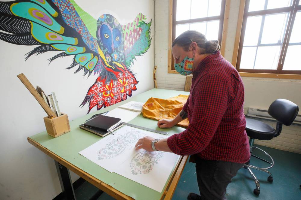
Vincent always starts a new project by putting pencil to paper. That tactile element is important to him; before it’s a mouse and screen, it’s always pencil and paper.
He is heavily influenced by Woodlands style and Inuit art, as well as the idea that, say, a bear doesn’t have to look like a bear, but rather an interpretation of a bear. He points to The Enchanted Owl, Kenojuak Ashevak’s iconic 1960 stone-cut print featuring a boldly coloured owl with vivid, stylized plumage, as an example.
“That’s design. She was drawing from her heart and putting her spirit onto stone. That came from her being and it was accepted. I wish I could tell her how important her work is to a lot of people like me, because what she was doing was merging the two worlds of design and art.”
Vincent leaves the room for a moment to retrieve what he calls his bible: a hardcover edition of 7: Professional Native Indian Artists Inc., a collection showcasing the work of the hugely influential Indigenous Group of Seven, as they are colloquially known, composed of artists Jackson Beardy, Eddy Cobiness, Alex Janvier, Norval Morrisseau, Daphne Odjig, Carl Ray and Joseph Sanchez.
Vincent raps a knuckle on the book, which is heavily bookmarked with Post-its. “This is where I get my inspiration from these days because you get into the minds of these amazing artists.”
In particular, there’s a Jackson Beardy quote that serves as something of a compass for Vincent. He reads it aloud:
“If an Elder tells me something, I cannot visualize exactly what he says because I am not him. I only interpret what he says incorporating my own life and philosophies. At one time, I tried to hide behind an Indian image of the fact that my paintings were based strictly on legends. Now that I am myself, free to express the feelings that I have, I can accept the responsibility of the people I represent. I add the basic legends their integrity, their dignity and, in that sense, I translate their oral art into a meaningful visual way. I can’t paint anything if I don’t have the background and the cultural knowledge to make it right.”
“This pretty much encapsulates what I do, because I do it in a different way, but in the same method, with the same respect.”
Indeed, there is sensitivity and care required to do this work. Vincent never wants to do anything that would upset a community or nation. With all the designs he’s done, there’s been a vetting process that includes sharing circles and consultations with elders, depending on the project. Vincent brings curiosity to the process; he is trying to answer a question: what is it that they want to communicate?
Vincent incorporates a lot of flora and fauna in his designs, which is intentional. “I discovered that plants and animals, to me, are the way to go, because they cross boundaries, they cross nations.”
The plants and animals may be recognizable — such as the minimalist polar bear and paw, rendered in tundra whites and blues, that serves as the logo for Churchill Health Authority — or they may be more abstract. For SING Canada, or Summer Internship for Indigenous Peoples in Genomics, Vincent used the colours and patterns from the DNA sequences of the four sacred medicines — tobacco, sage, cedar and sweetgrass — to create a logo that resembles quill work.
Or, they might look like 34 floral elements to represent 34 First Nations. For the SCO project, Vincent was similarly inspired by plants and medicines to represent the Dakota and Anishinaabe people. His original design was heavily rooted in geometrics — the Dakota people are the Star People, after all — but switched gears when he learned from a professor that the Dakota people also included floral patterns in stitching and beadwork, not unlike the Métis people.
“This represents them through and through,” he says of the final design, a product of collaboration, consultation and Two-Eyed Seeing.
“You have to know your client — that’s what was taught to me in school,” he says. “In this case, you have to know your people. You have to know your community.”
jen.zoratti@freepress.mb.ca
Twitter @JenZoratti

Jen Zoratti is a columnist and feature writer working in the Arts & Life department, as well as the author of the weekly newsletter NEXT. A National Newspaper Award finalist for arts and entertainment writing, Jen is a graduate of the Creative Communications program at RRC Polytech and was a music writer before joining the Free Press in 2013. Read more about Jen.
Every piece of reporting Jen produces is reviewed by an editing team before it is posted online or published in print – part of the Free Press‘s tradition, since 1872, of producing reliable independent journalism. Read more about Free Press’s history and mandate, and learn how our newsroom operates.
Our newsroom depends on a growing audience of readers to power our journalism. If you are not a paid reader, please consider becoming a subscriber.
Our newsroom depends on its audience of readers to power our journalism. Thank you for your support.
Related Articles
The power and glory in a new story